Kitchen Colour Psychology: Expert Guide to Choosing Countertop Colors That Make You Happy
Taking a deep dive into kitchen colour psychology, and how this can help with choosing countertop colours!
Kitchen color psychology affects our daily lives more than we realize. Our kitchens become the heart of daily activities where we prepare meals, socialize, and create memories. The colors surrounding us quietly shape our emotions and well-being. Research shows that colors can change our mood, energy levels, and appetite - making kitchen countertop color choices matter more than expected.
Color psychology in design studies how different hues shape our mental state and behavior. Warm colors like reds and yellows in kitchens spark conversation and boost appetite (great news for parents with picky eaters). Cool blues and greens create a calm environment that lowers blood pressure and heart rate. The perfect kitchen color depends on the atmosphere you want. Kitchen spaces with neutral tones help people relax and feel less stressed, while bold colors boost energy and creativity.
This piece shows you how to pick countertop colors that line up with your emotional goals. The right choices will help you create a kitchen space that brings genuine happiness.
Colors have a powerful effect on our living spaces and shape our daily experiences. Color psychology in kitchen design studies how different colors affect our emotions, behaviors, and physical responses. It looks at the connection between colors and our mental state that goes beyond just making things look good.
Colors speak to our subconscious mind without words. Our brains react to different shades emotionally and mentally, often without us realizing it. Designers use this knowledge to create spaces that work well and look attractive. Our emotional responses to colors aren't random - they come from both our biology and cultural background.
Different colors trigger responses in our brains at conscious and subconscious levels. These responses change how we feel and act in any space. Science shows that low wavelength colors like green help people focus better, which makes them great choices for practical spaces like kitchens. Research at the University of Surrey found something interesting - blue light lowered people's blood pressure to levels similar to what blood pressure medications achieve.
The kitchen is a home's heart where families gather, talk, and create memories. The colors we pick for this space can change our daily life and interactions.
Red and other warm colors make people hungry and more social - perfect for families who love to host guests. Studies show red speeds up heart rate and creates excitement. Parents might find this helpful if their kids are picky eaters.
Blue and other cool colors help people relax. Research shows they can lower blood pressure and slow down heart rate. This makes blue a great choice for creating a peaceful kitchen atmosphere. Green brings balance and connects us with nature. It also helps people concentrate better while cooking or doing kitchen tasks.
Neutral colors are flexible and balanced. White bounces back all light wavelengths to make spaces brighter. Black adds a touch of sophistication, while gray creates a subtle background that lets other design elements stand out.
These colors do more than just look good - they actively change our mood and well-being in one of our most important living spaces.
Image source: NavigateReality
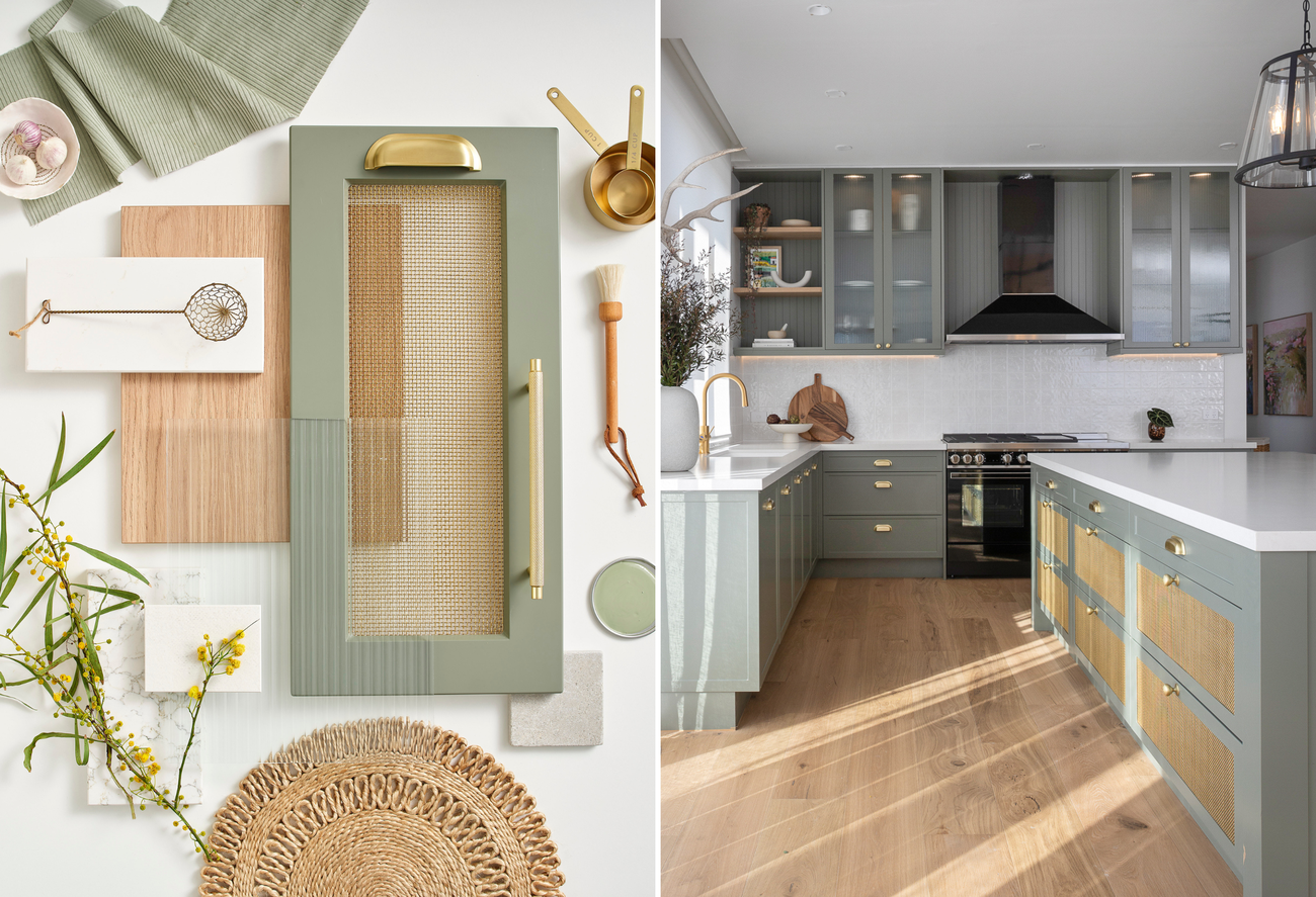
Image Source: Freedom Kitchens
Your kitchen countertop color choice can completely change how you feel in the space. The countertop surface is a vital part of kitchen color psychology that shapes the room's mood beyond just looks. Here's how to pick countertop colors that match your emotional needs.
Bright countertop colors can spark conversation and activity in your kitchen space.
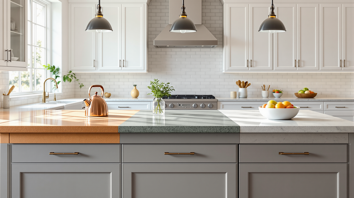
Energizing countertop options include:
These dynamic colors work best in kitchens where you host often or need a morning boost. The mood-lifting effects become even stronger when you match these countertops with the right cabinet colors.
Calming counterop options include:
You can create an even more peaceful space by combining these countertops with soft white cabinets and natural wood elements. This mix turns cooking into a relaxing activity instead of a hectic one.
Balanced and versatile countertop options include:
These balanced choices work great in open-concept homes where kitchens flow into living areas. They provide a timeless foundation that grows with your style changes while keeping a steady emotional atmosphere.
Picking the perfect countertop color goes beyond personal taste. Your final choice should take into account several practical factors that help your selected color blend seamlessly with your space. These elements can substantially change how colors look and feel in your kitchen.
Your kitchen's size directly shapes how colors present themselves. Lighter countertops like white, cream, or light gray make smaller kitchens appear more spacious by bouncing light around the room. Larger kitchens work well with darker countertops such as charcoal or black. These darker shades add warmth and coziness without making the space feel tight.
The layout shapes color perception too. Open-concept kitchens look best with countertop colors that flow smoothly into connected spaces. Galley kitchens work better with brighter shades to avoid feeling confined. Kitchen islands are great spots to add color contrast. You might want to give them a different countertop shade than the surrounding surfaces.
Light is a vital part of kitchen color psychology. Natural light shifts throughout the day and changes how countertop colors appear. Morning sun adds yellow tints, midday light looks more blue, and sunset creates red glows on surfaces. This means your countertop sample might look completely different at home compared to the showroom.
Artificial lights change what color should a kitchen be. Warm-toned bulbs (2700K-3000K) make reds and yellows pop while blues and greens might look dull. Cool-toned bulbs (4000K-5000K) bring out blues and greens but can make warm colors look flat. Your countertop's finish—glossy or matte—also changes how light plays on the surface.
Start by looking at your cabinets when picking countertop colors. White cabinets work well with almost any countertop shade. Wood cabinets pair naturally with neutral tones that match their undertones. Color psychology kitchen principles suggest you should create either matching harmony or purposeful contrast.
Floor color plays its part in countertop selection. The space between these elements creates a visual connection that needs balance. Backsplashes, wall colors, and fixtures add to the overall color scheme and should work together with your countertop choice to create a unified look.
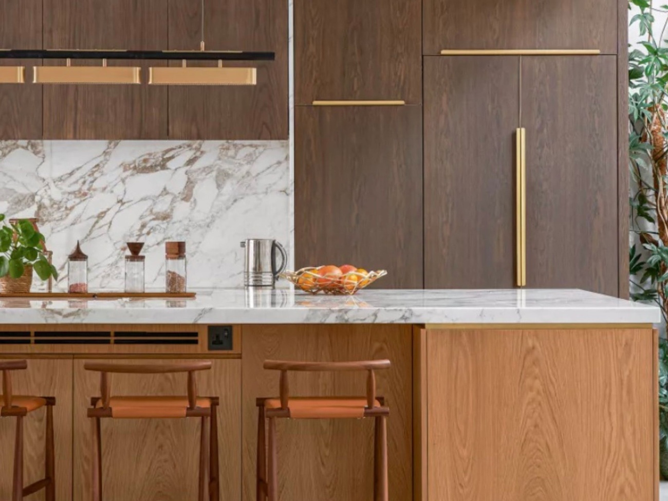
Image Source: Livingetc
Beautiful countertop colors might not look their best when people make common mistakes. Many homeowners make critical errors while picking countertop colors. These errors can ruin the kitchen color psychology they want to create.
Light's interaction with color makes a big difference in countertop selection. Natural light shifts throughout the day and casts different shades on surfaces. A perfect-looking color in the showroom's fluorescent lighting might look completely different at home. Most homeowners skip a vital step. They don't test samples in their actual kitchen under different lighting conditions.
Colors look warmer under incandescent lighting (2700-3000K) and cooler under daylight bulbs (4000K). The best results come from viewing potential countertop colors at different times of day. Look at them during morning, afternoon, and evening hours. You'll understand how they change with shifting light. This simple check helps avoid the letdown of dull or discolored countertops after installation.
Current design trends can lead people to make regrettable color choices. Today's fashionable choices might feel outdated tomorrow. Those trendy turquoise countertops will greet you every morning.
Your personal style and emotional response should guide what color should a kitchen be. A countertop color that makes you happy will stay satisfying long after current trends fade away.
Balance prevents visual chaos in color psychology kitchen design. Multiple bold colors create a disconnected look and overwhelm the eyes. Designers suggest the 60-30-10 rule: 60% dominant color, 30% secondary color, and 10% accent color.
Create a unified color palette before finalizing countertop colors. Include cabinets, backsplash, flooring, and walls in your plan. This integrated approach will make your kitchen feel balanced. The countertops will improve the overall design instead of fighting against it.
The right countertop color does more than just look good—it shapes your kitchen's entire feel. Colors quietly affect our emotions in different ways. The perfect shade creates a kitchen that's not only beautiful but also matches your emotional needs.
Your countertop color should reflect your priorities and lifestyle instead of current trends. These surfaces will be part of your daily life for years. The size of your kitchen, lighting, and other elements are vital factors in how your chosen color will end up looking in your space.
We know it's hard to picture different countertop colors in your kitchen. Our showroom at 71 Ilsley Ave lets you see our full collection. You can learn about how different colors look under various types of lighting. This hands-on experience is a great way to get insights you can't get from just browsing online.
Most importantly, listen to your gut feeling when making the final choice. The right countertop color should make you smile every time you walk into your kitchen. It creates a space where cooking, gathering, and making memories feel natural and uplifting. From energizing bright quartz to calming blue-tinted surfaces, your choice will make your kitchen the true heart of your home—a place that brings you joy every day.
